
App Welcome Screen
The App Welcome Screen serves as the initial point of interaction between users and a mobile application, setting the tone for a positive user experience and significantly impacting users' initial impressions of the app. It appears right before a registration/login screen. Here's how to easily craft one with the TRIFFT Loyalty Cloud platform.
Step 1: Create a New Channel
To get started, you need to create a new Channel to host your loyalty mobile app onboarding. Follow these simple steps:
- Navigate to Settings -> Channels.
- Click the "Add new" button.
- Fill in the required information:
Name: For your internal reference only.
Type: Select MOBILE_APP.
Description: For your internal reference only.
Don't forget to click "Save" to save your progress.
Step 2: Select App Welcome
- Once saved, click the three dots, then the eye icon to the right of the newly created channel.
- Click the Add new button.
- In the Type field, select "App_Welcome and save your changes.
Step 3: Draft Your App Welcome Screen
Now that you've selected the onboarding type, you can start drafting your loyalty mobile app onboarding process.
Follow these steps:
- Click the three dots icon, then the pencil icon again next to the channel.
- Begin drafting the welcome screens by specifying the steps and content you want to include.
- Save your progress regularly by clicking the Save as Draft button as you work on your onboarding process. Once you are happy with your designs, click the Publish button.
Fields
While customizing the user experience of your loyalty app, you have the flexibility to choose whether to implement an "App Welcome Screen" or omit it altogether. To enable the welcome screen, simply toggle it on within the platform settings.
When the toggle is off, the app will bypass the welcome screen, and users will be directed straight to the login/registration screen upon launching the app.
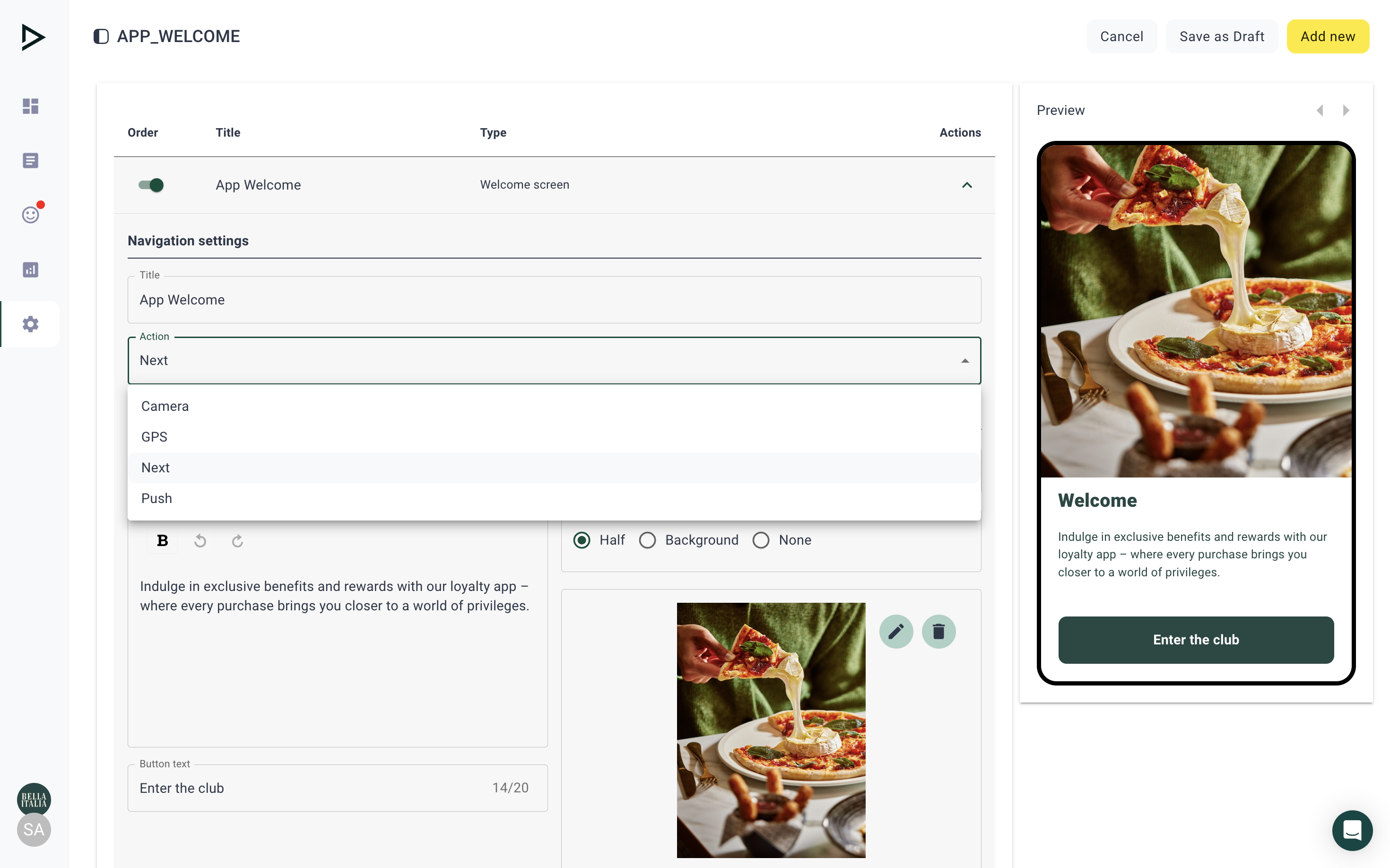
Title (Internal): For internal use only; not visible outside the platform.
Action: Determines the subsequent user experience:
- Camera: Opens the phone camera
- GPS: Prompts the user to allow the app to access their phone's location tracking
- Next: Takes the user to the subsequent screen
- Push: Prompts the user to allow notifications
Content Title, Description: Optional display on the screen visible to all users (this can by previewed in the phone mock up on the right)
Image: Options for visual representation:
- Half: The screen is divided into two parts: text and visuals
- Background: An image serving as the backdrop for the entire screen or page (optional)
- None: No image is displayed; only a solid-colored background appears in the app
Button: Visible to all users and customizable in the settings below
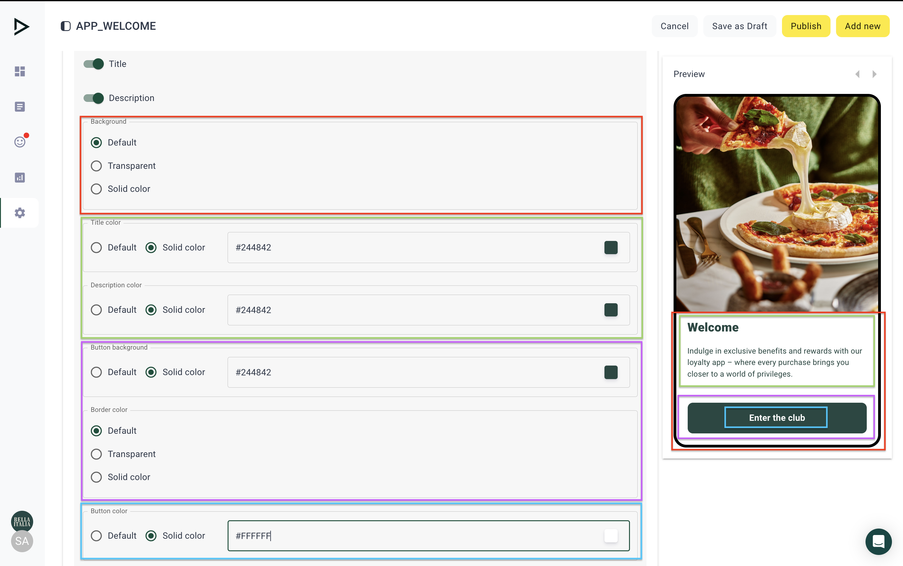
Now that the basic settings are complete, you have the flexibility to further refine the design to align with your preferences.
Background - Influences the color of the whole text background. It can either be default, transparent, or solid (you may input any color in hex code starting with #)
Title color, Description color - Changes the color of the title/subtitle
Button background - Changes the color of the main button
Border color - Changes the color of the border of the main button
Button color - Changes the color of the text used in the main button
Updated 26 days ago