Mobile App Customizations
TRIFFT is a versatile loyalty platform that provides clients with a vast range of customization options. You can personalize the platform to your taste by adding your own branding, colors, logos, your own images, and copy, among others.
There are two types of modifications when using our Content Cockpit administrations:
- The ones that are visible instantly in any of your selected customer-facing channels (including mobile app, web, and smart card) and do not require any action from the TRIFFT Team. These include minor changes to content (texts, images) and all the basic settings.
- Major changes that need to be performed by the TRIFFT Team as they require a new release. To perform a new release, app configuration files and other app settings are adjusted, app binaries are built and submitted to Apple App Store and Google Play for review. Only then are new versions of apps available to consumers. This process typically takes several days.
Modifications visible instantly, without the need for a new release
With TRIFFT, you have complete control over your loyalty program and can make changes quickly and easily through our Content Cockpit administration, without the need for extensive technical knowledge or support.
Any changes you make here are visible in real-time and reflected in the consumer-facing channels immediately. These include (but are not limited to): Venue listings and attributes, Coupons, Rewards, News, Consent wording and structure, Pages content, Contests, and Leaflets.
Modifications that require a new release
When setting up a loyalty program, TRIFFT works with you hand-in-hand to make sure that it meets all your needs and requirements in terms of design, branding, loyalty mechanics, and all necessary functionality.
As your business evolves, you may find the need to revamp your loyalty program. For instance, you may want to add new modules, change the mechanics of collecting points to using coupons, or perhaps introduce loyalty tiers. These changes are more significant and require careful planning to ensure a smooth transition. That's why our team of experts will perform these changes for you.
Mobile apps always utilize the same basic layout with a status bar at the top, navigation bar at the bottom, and a variable middle section, the gold standard for loyalty apps. Overall font typeface and sizes are fixed.
The following overall settings may be customized:
* App icon and name
* App wording for all standard strings
* App color scheme for various buttons, onboarding screens, warning banners, etc.
* Basic light and dark font (by default #00000 and #ffffff, respectively)
* Icon representing "points" shape and color
* Number of icons in navigation bar - from 2 (homepage and more) to 6
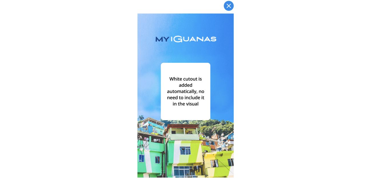
Loyalty card design
Background of the loyalty card
- Single PNG (i.e. logo needs to be part of the image)
- 560 x 888 px dimensions
- No white cutout for a barcode/QR code - this is added automatically as an overlay

Example of a card visual in the mobile app
Related Articles
Members, Contests, Consents, New mobile app homepage builder, Website Customizations.
Updated 3 days ago
