
Onboarding Screens
One key aspect to enhancing user experience is creating a well-crafted onboarding process. It appears after the user's registration/first login.
| Situation | Onboarding Feature Displayed |
|---|---|
| Newly registered member on new device | YES |
| Newly registered member on device where another account was used before | YES |
| Existing member after sign in on new device | YES |
| Existing member after sign in on device where they completed onboarding before | NO |
In this support article, we'll guide you through the steps for creating a loyalty mobile app onboarding using TRIFFT Loyalty Cloud.
Step 1: Create a New Channel
To get started, you need to create a new channel to host your loyalty mobile app onboarding. Follow these simple steps:
- Navigate to Settings -> Channels.
- Click the "Add new" button.
- Fill in the required information:
Name: For your internal reference only.
Type: Select MOBILE_APP.
Description: For your internal reference only.
Don't forget to click "Save" to save your progress.
Step 2: Select Onboarding Type
- Once saved, click the eye icon next to the newly created channel.
- Click the Add new button.
- In the "Type" field, select "Onboarding and save your changes.
Step 3: Draft Your Onboarding Process
Now that you've selected the onboarding type, you can start drafting your loyalty mobile app onboarding process.
Follow these steps:
- Click the pencil icon again next to the channel.
- Begin drafting your onboarding process by specifying the steps and content you want to include.
- Save your progress regularly by clicking the Save as Draft button as you work on your onboarding process. Once you are happy with your designs, click the Publish button.
Screen Types Within Onboarding
Welcome Screen
The welcome screen is displayed in the editor by default. You can choose to show or hide it in the app by toggling it on or off.
Please note that there are two types of welcome screens: the first one that displays before registration/login. The one described in this section appears after registration/login and has more of an informative/design character.
If you wish to add other screen types to your onboarding process, click the 'Add new' button in the upper right corner.
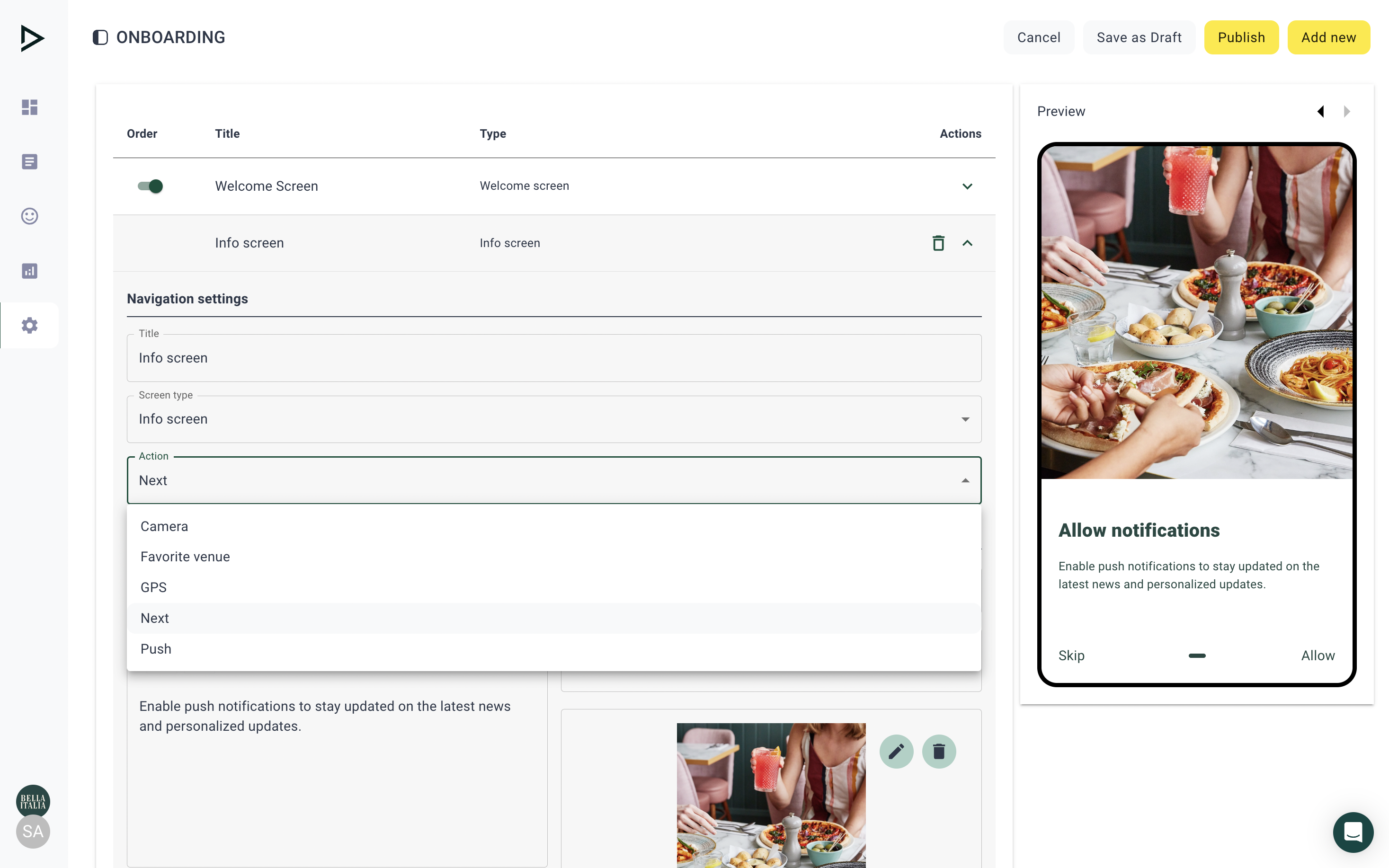
Info Screens
Info screens allow you to put multiple types of screens in your onboarding process, differing in
Title (Internal): For internal use only; not visible outside the platform.
Screen type:
- Info screen - A versatile screen prompting various actions, such as opening the phone's camera, configuring a favorite venue, enabling location tracking, permitting push notifications, or seamlessly progressing to the next step in the user journey
- Preference center screen - ask customers to share their preferences and get access to zero party data
Action: Determines the subsequent user experience:
- Camera: Opens the phone camera
- Favorite venue: Prompts the user to choose their preferred venue
- GPS: Prompts the user to allow the app to access their phone's location tracking
- Next: Takes the user to the subsequent screen
- Push: Prompts the user to allow notifications
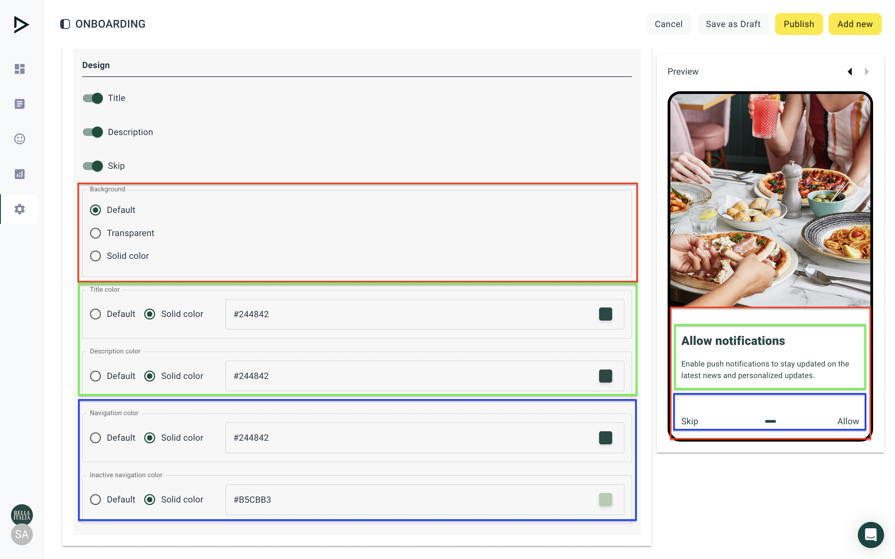
Content Title, Description: Optional display on the screen visible to all users (you can preview this in the phone mock up on the right).
Image: Options for visual representation:
- Half: The screen is divided into two parts: text and visuals (only available when "Info screen" is selected)
- Background: An image serving as the backdrop for the entire screen or page (optional)
- None: No image is displayed; only a solid-colored background appears in the app
Skip/Next Button: Visible to all users and customizable in the settings below. These are navigation buttons at the bottom of the screen.
Now that the basic settings are complete, you have the flexibility to further refine the design to align with your preferences.
By toggling the switch on and off, you determine whether the Title, Description, and Skip options are visible in the app (toggle on) or hidden (toggle off).
The customization options available when "Info screen" is selected are:
Background - Influences the color of the whole text background. It can either be default, transparent, or solid (you may input any color in hex code starting with #).
Title color, Description color - Changes the color of the title/subtitle
Navigation color - Defines the color of active navigation elements
Inactive navigation color - Represents the color of navigation elements when not currently in use
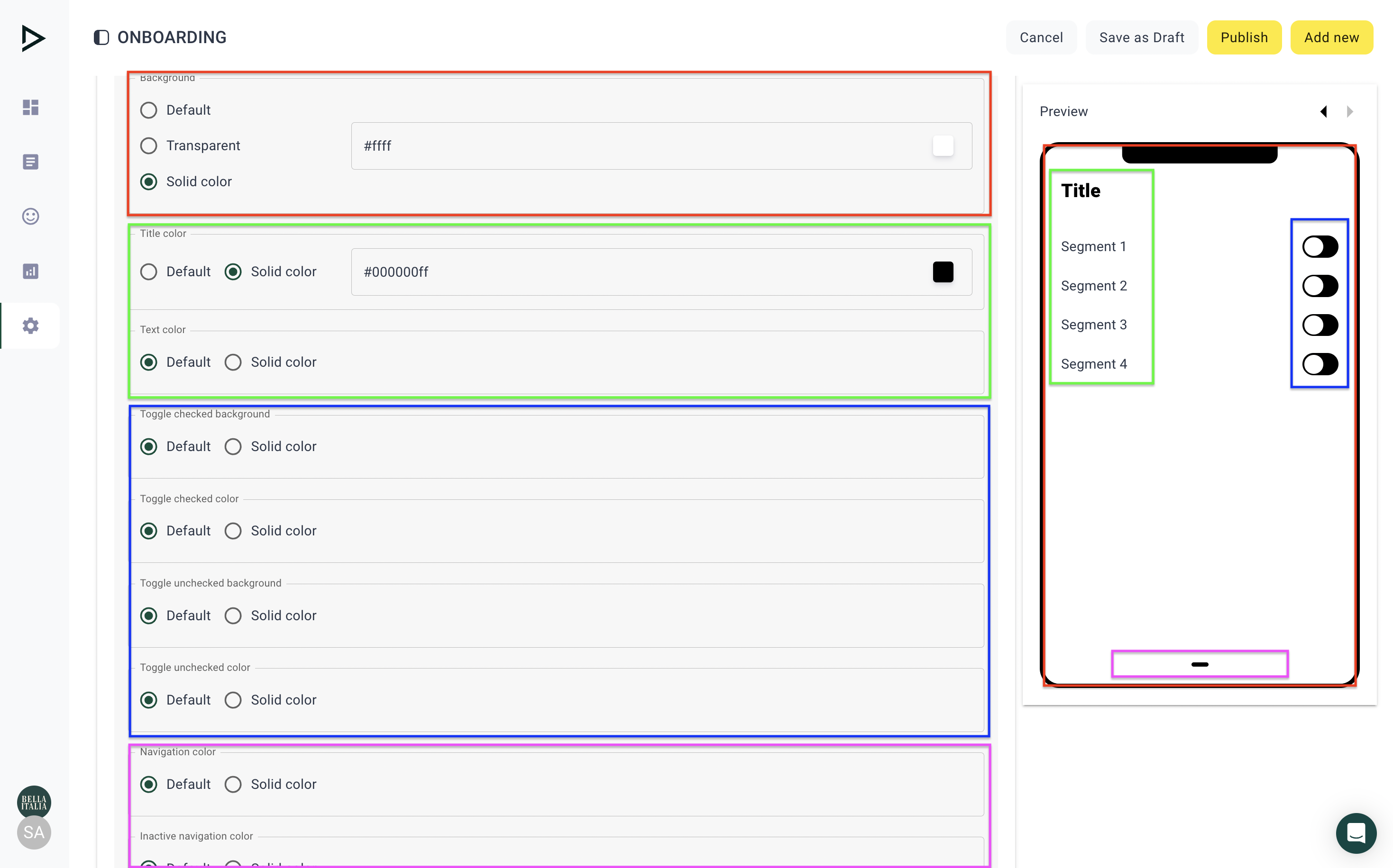
The customization options available when the "Preference center" screen is selected are:
Title, Skip - When toggled on, they appear in the app. When toggled off, they do not appear in the app.
Background - Influences the color of the whole text background. It can either be default, transparent, or solid (you may input any color in hex code starting with #).
Title color, Text color - Changes the color of the title/subtitle
Toggle checked background and color - Specifies the color of an active toggle when it is checked (toggle on)
Toggle unchecked background and color - Specifies the color of an inactive toggle when it is unchecked (toggle off)
Active/Inactive navigation color - Represents the color of navigation elements
Updated 3 days ago