
Surveys
This article explaines the main purpose of Surveys feature.
What Are Surveys?
- Definition: Surveys are customizable forms designed to collect feedback from customers by creating interactive questionnaires. Whether you need a simple form to collect specific information or a customer satisfaction survey, this feature enables structured feedback collection directly within the app.
- Purpose: They help businesses understand customer preferences, measure satisfaction, and improve services based on real user insights.
Key Features
-
Customizable Survey Builder
- Surveys can be designed using an intuitive drag-and-drop interface.
- Multiple question types are available, such as multiple-choice, rating scales, and open-ended responses.
-
Branded Visual Customization
- Customize the header, add images, and style survey buttons to match your branding.
-
Flexible Distribution & Scheduling
- Surveys can be set to run for a specific period to ensure relevant data collection.
- They can be embedded within the app or triggered via push notifications.
Example Use Case
Scenario: Gathering Post-Purchase Feedback
A retail company wants to measure customer satisfaction after a purchase.
- A survey is created asking customers to rate their shopping experience.
- After completing a purchase, customers receive a push notification linking to the survey.
- The company collects real-time feedback on service, product quality, and overall experience.
By using surveys, businesses can make data-driven improvements based on customer opinions.
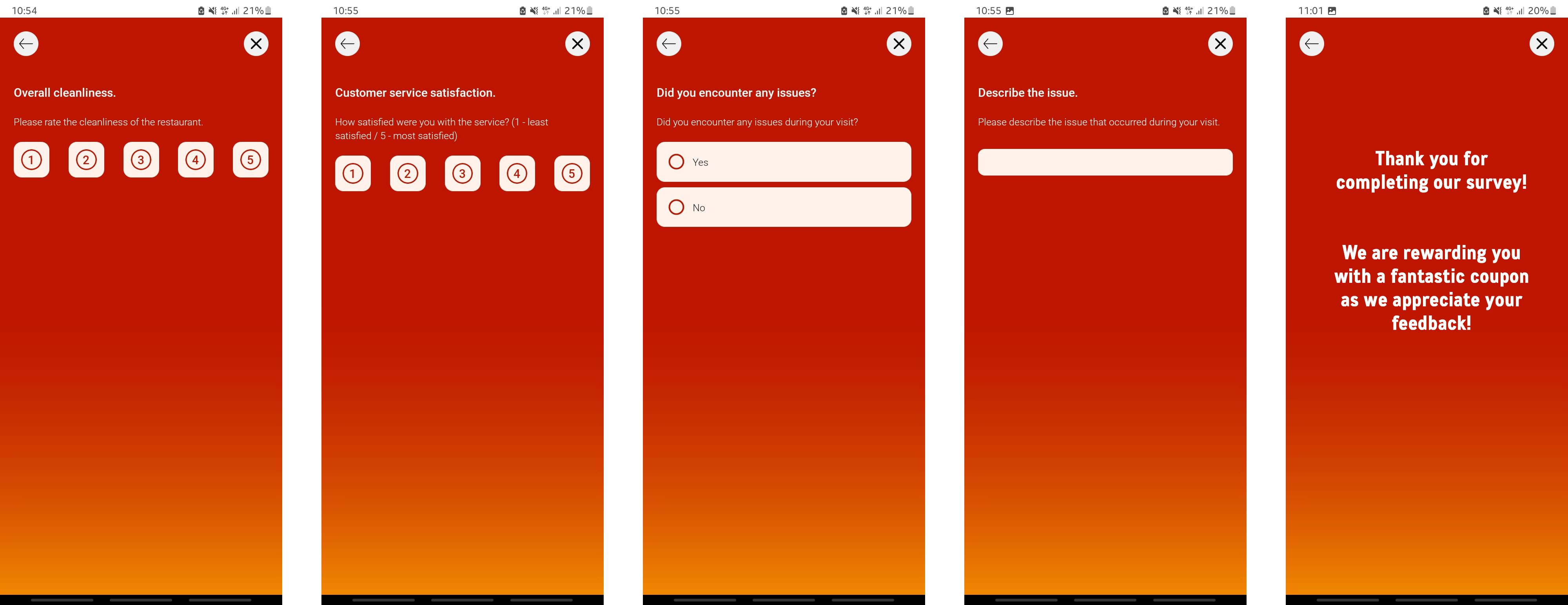
Example of post-transaction survey module in app
Updated 3 days ago